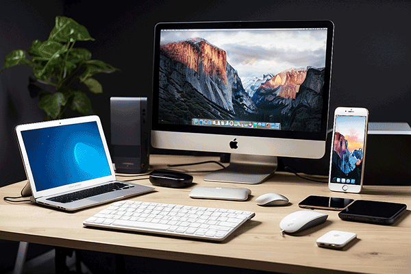
Blogs are designed to be incredibly versatile and accessible, making them easily viewable on a wide array of devices, from desktop computers to smartphones and tablets. This universal accessibility is largely due to responsive web design, a method that enables websites, including blogs, to automatically adjust and optimize their layout and elements based on the screen size and resolution of the user’s device. As a result, whether a visitor is reading on a large monitor, a laptop, or the compact screen of a mobile phone, the blog’s content, images, and structure will reconfigure to provide an optimal viewing experience.
Furthermore, advancements in web technologies and standards have enhanced the compatibility of blogs across different web browsers and operating systems. This means that blogs can maintain a consistent appearance and functionality whether someone is accessing them via the latest version of Chrome, Safari, Firefox, or any other browser. The use of scalable vector graphics (SVGs) and flexible grid layouts also ensures that images and textual content remain clear and legible, no matter the device’s screen size or orientation.
Additionally, the proliferation of mobile devices has prompted blog platforms and content management systems to prioritize mobile-friendly designs. Many now offer themes and plugins specifically optimized for mobile viewing, ensuring that blogs not only look good but also load quickly and are easy to navigate on smaller touchscreens. This mobile-first approach is crucial, considering the increasing amount of time people spend consuming digital content on their phones and tablets.
In essence, the inherent design and technology behind modern blogs ensure that they are accessible and user-friendly on any device, providing a seamless reading experience. This universal accessibility is vital for reaching a wider audience, improving engagement rates, and keeping readers coming back, regardless of how they access the internet.